Enterprise App UI Design | In-Depth Guide
In enterprise environments, productivity and efficiency are everything. When you have thousands of users, even the most minor process improvements can hugely impact revenues. Of course, there are countless different ways you can streamline processes.
Today, we’re diving deep into enterprise app UI design.
More specifically, we’ll cover the unique challenges faced by enterprise design teams, the concrete strategies you can implement to overcome these, the tools at your disposal, and how low-code tools like Budibase are changing the way large organizations build custom apps.
But first, let’s take a look at the role effective UIs play in an enterprise context.
What is enterprise app UI design?
This should be fairly self-explanatory. Enterprise UIs are the front-end layers of applications used by large, internationally trading companies. The design of these largely determines the usability, efficiency, and return on investment on whatever platform you’re building.
This applies to everything from single-function micro-apps to large-scale ERM tools, or anything else that your employees use to carry out their daily work.
The goal is to design interfaces that empower users to be as productive, cost-effective, and accurate as they can be.
The more embedded a given UI is in your employees’ work, the more impact this has.
But obviously, this is true for any application. Let’s think about why it’s particularly important in the context of design for enterprise UX.
What’s different about enterprise applications?
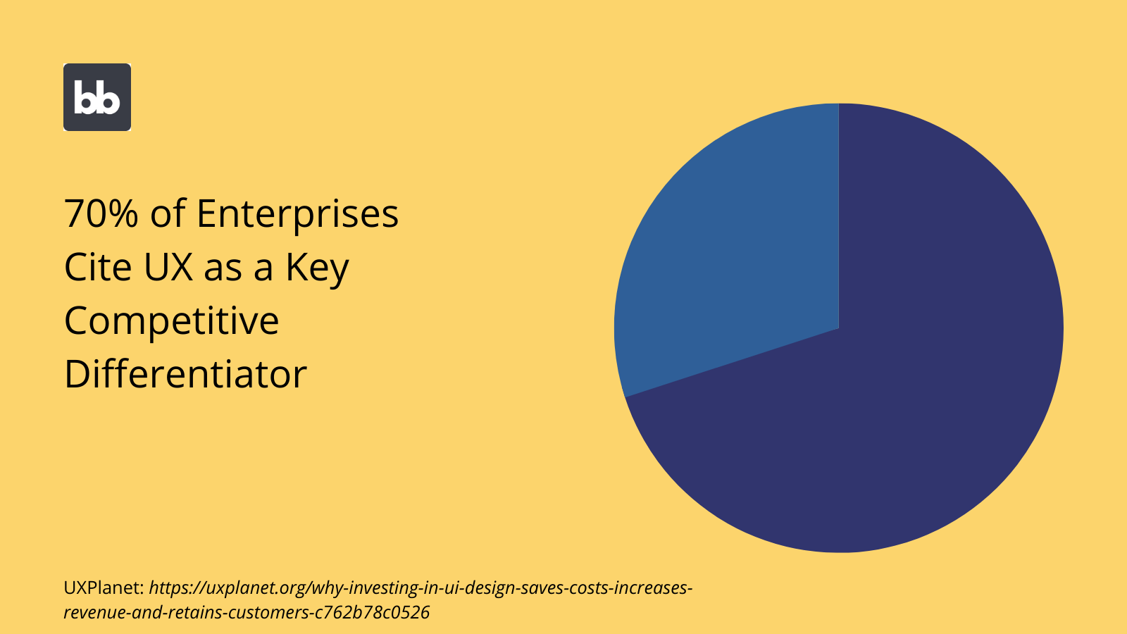
Enterprises buy, build, and use software differently from your typical organization. The most obvious point of difference here is scale. Enterprise applications simply have more users, all else being equal.
This means that the impacts of efficiency savings are amplified.
There are a couple of additional layers to this too, including:
- Reducing training burdens.
- Streamlining employee onboarding.
- Maintaining accuracy across high-volume workflows.
Another key distinction is that enterprises typically have much larger, more complex software stacks. That is, a greater number of tools are by used different employees across the organization.
This means that there’s a greater need for UX designers to unify user experiences across different platforms.
That is, users should have a broadly similar experience across different tools, wherever possible. The idea here is to make working across different platforms as smooth as possible for users.
For instance, using global designs and app themes.
It’s also worth noting that the UX priorities in enterprise UI design are a little bit different. Enterprise users are sometimes referred to as a captive audience. This means that there’s less need to focus on aesthetics, or projecting a certain image of your brand.
Rather, design is purely functional. The goal is efficiency and effectiveness over anything else.
Check out our ultimate guide to app UI design to learn more about UX priorities in different kinds of tools.
Enterprise app design challenges
From a design perspective, enterprise tools pose several unique challenges. Design teams must grapple with additional constraints, concerns, and pain points that are less common in smaller organizations.
Here are the key issues that crop up in enterprise app UI design.
Complexity
Everyday processes are typically much more complex and multifaceted in enterprises. This can make interface design fairly tricky, as we still need to balance this fact with the need to produce clean, intuitive applications.
One key element of this is that there will generally be a larger number of discrete user roles within any given tool. Each of these will interact with your applications differently, which must be reflected in your UIs.
Additionally, users within any given role might also have access to a larger number of actions, or more complex decision-making within actions themselves.
Balancing this with the need to create intuitive, streamlined used experiences is tricky.
Security
Enterprises also have heightened security needs, both at the level of dealing with more complex compliance standards and being a more prominent target for hackers and cybercriminals.
Of course, for the most part, this is handled at a back-end, infrastructure, or authentication level.
Nonetheless, interface design plays a role too.
After all, your app’s front-end determines the actions that users can take, and the situations they can take them in. As such, enterprise design teams are constrained by security concerns to a far larger degree than in small and medium-sized companies.
Scalability
We’ve touched on scale already. Any enterprise app has the potential to be rolled out to thousands or even tens of thousands of users. As such, your UIs must be built to scale horizontally.
There are a few different factors at play here.
One is your UIs’ performance. Specifically, how quickly your app’s front-end loads and allows users to perform actions, especially when under pressure from large traffic volumes. Again, this is determined mostly by back-end factors, but your UI design still plays a role.
Simple optimizations like minimizing clutter in your interfaces and avoiding large assets can help to ensure fast load speeds, even at scale.
Responding to change
Enterprise design teams must respond to changing needs across the organization. Processes evolve, external partners get replaced, and responsibilities shift from one department to another.
Keeping your tools up to date with these new realities can be challenging.
The key is maintaining the same basic experiences for users, as well as minimizing disruption to their daily work. Ideally, users might not notice that much has changed at all in terms of how their tools work.
Say for example that you have a custom tool for your marketing team to manage direct mail, and then you switch to a different vendor for your fulfillment. The new vendor has a slightly different pricing structure, so your team will need to provide different order information.
Our task as designers would be to reflect this while retaining as much of the original user experience as we can. So, we’d want to update our form UI design, without altering the substance of the steps users need to take to make an order.
Separation of concerns
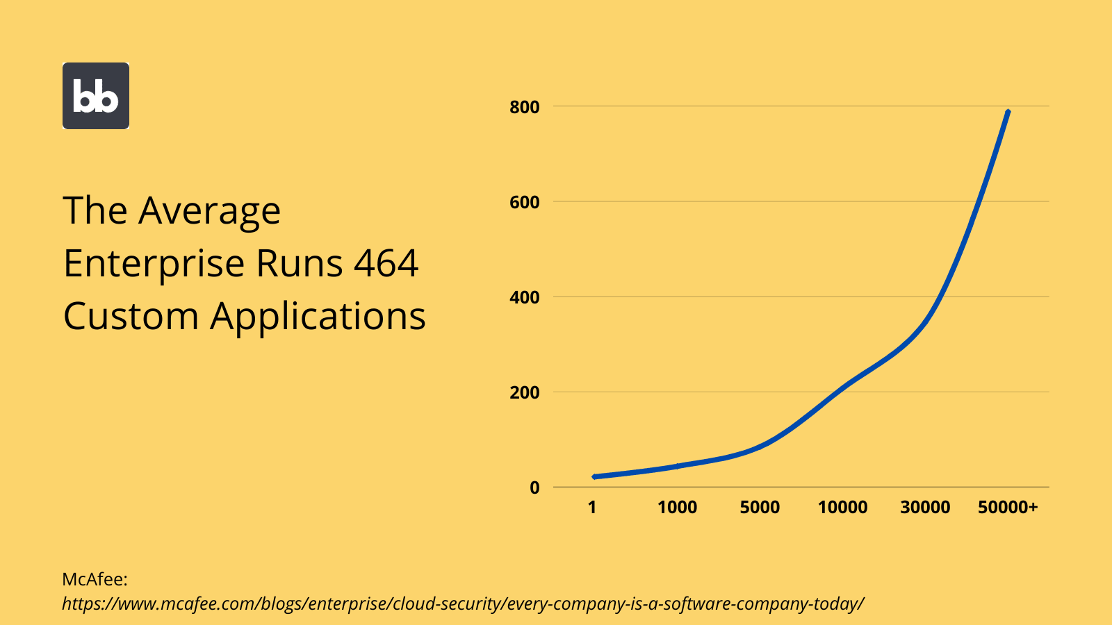
Enterprise software is also built around a slightly different structure, offering high levels of integration. For example, you’ll often have large data sets or centralized tools for certain core functions, that are connected to multiple user interfaces for specific workflows.
So, you might have a central data source for all of your customer information and a single mailing client to handle communications with these customers. However, your marketing, sales, accounts, support, and management teams will use these resources very differently.
Rather than creating a single application to manage customer interactions across every business vertical, it’s often more effective to create several discrete UIs for more specific functions.
Each of these can leverage the central resources to differing ends, but the resources themselves remain independent of the applications.
This is a different model for building applications than is typically deployed in smaller organizations.
High-volume information
Perhaps the biggest challenge for enterprise app UI design is balancing established UX best practices with the sheer volume of data required in large organizations. To put it more crudely, it’s just hard to create attractive UIs when you have a lot of information to squeeze in.
There are several strategies you can employ here.
One of the key techniques used by enterprise designers is clustering. This means grouping related components and information together, to make them easier for users to find.
For example, you might need to build a dashboard for resource allocation across the entire company. This includes high-level metrics and drill-downs for financial, HR, technical, and other resources.
In a large organization, the design of this type of tool would quickly become cluttered.
Clustering allows you to provide a smooth UX despite this, by enabling users to quickly locate related metrics.
We’ll look at a few more strategies you can employ to manage information-heavy UIs when we come to our enterprise interface design tips.
Check out our in-depth guide to table UI design .
Other challenges for design teams
Enterprise design teams are also constrained by non-technical issues, especially operational rules and procedures. Of course, these are all in place for a reason. Nonetheless, they can create real barriers to procuring and developing applications.
Let’s take a look.
Vetting, sign-off, and approval
We couldn’t talk about enterprise design systems without touching on this. Getting new tools signed off for widespread use in an enterprise environment is normally a drawn-out, difficult process, involving a range of complex vetting rules.
This can comprise technical, privacy, support, compliance, and future-proofing concerns.
Obviously, when enterprises invest in new external tools, they want to have confidence that vendors will still be around for as long as they need the platform.
Other times, your IT team might have specific rules surrounding the kinds of code frameworks, licensing arrangements, hosting methods, or other standards used by vendors.
This constrains design teams by restricting the specific tools they can use to build enterprise UIs.
Often, this means that in-house builds or open-source tools are preferred, as they offer enterprises more flexibility to implement their internal standards and prevent issues with vendors ending support.
Support and maintenance
Support and maintenance arrangements are also a key priority for enterprises. This influences the true cost of using a particular tool over the long term. Of course, this also has a huge impact on how your employees use tools, especially when problems arise.
This is a massive factor in build/buy decisions.
For one thing, there’s the cost of actually contracting out support functions or handling these in-house. Besides this, there’s the effectiveness of whichever arrangement you choose and the indirect costs associated with this.
Again, enterprise design teams are constrained by policies here in their choice of tools.
Life-cycle management
Finally, there’s the issue of life-cycle management. That is, planning for the use, deployment, and modification of your tools over the entire time you’ll use them. You might even plan for product retirement and replacement.
For designers, the key point here is that enterprise builds tend to be highly iterative.
That is, applications go through several iterations, both in terms of achieving initial requirements and responding to change. As such, it’s vital that design teams can quickly respond to changing needs.
This can influence all kinds of design decisions. One key aspect is leveraging reusable components, screens, and blocks. That way, designers don’t have to build everything from scratch, every time they need to make a change or add new functionality.
B2B, B2C, & internal tools in enterprise environments
It’s also worth considering how different kinds of applications work slightly differently in enterprise environments. So far, we’ve largely focused on the use of internal platforms within enterprises, but there’s more to the story than this.
With that in mind, here are the key considerations you’ll need to make for internal, consumer-facing, and B2B enterprise UIs.
Internal tools
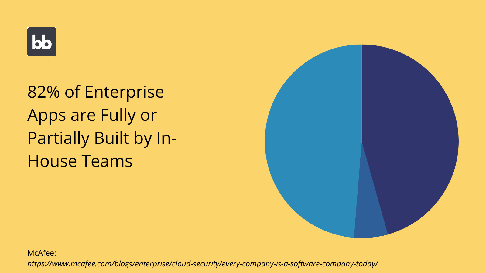
As we’ve hinted at already, internal tools are primarily aimed at empowering large numbers of employees to carry out high-volume work. This means that the focus is on accuracy, oversight, and efficiency, above aesthetics.
Additionally, there’s often a need to deploy new tools at speed. That is, it’s not uncommon for internal design and development teams to be tasked with turning around working platforms in short periods.
Sometimes this can be as little as a few hours.
As such, enterprise design teams normally leverage tools that allow them to achieve their desired functionality while minimizing build times.
Check out our ultimate guide to workload management tools .
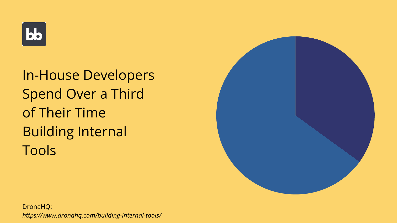
For example, take a look at our tutorial on how to build an Elasticsearch GUI .
Consumer-facing UIs
Of course, enterprises also rely on public-facing tools in a range of different contexts. This can be anything from simple survey applications to complex customer portal tools. In any case, this introduces a few additional concerns.
That is, we still need to create interfaces that maximize usability and efficiency. However, we also need to balance this with more conventional design concerns, including branding, aesthetics, and user engagement.
For example, in an internal tool, we wouldn’t need to consider how we encourage users to complete a given task since, in most cases, they simply don’t have a choice. Public users, on the other hand, have the option of giving up and doing something else.
Thankfully, a large part of the battle here is creating intuitive, easy-to-use UIs in the first place. Besides this, we can rely on the core principles of effective UI design to ensure maximum CRO.
Check out our ultimate guide to app UI design to find out more.
B2B UIs
Finally, we have B2B enterprise application UIs. More specifically, we have tools that are used by existing clients, vendors, partners, or other external stakeholders. As such, our design priorities are somewhere between those of internal and B2C tools.
For example, if you were building a self-service portal for vendors, you’d still want to create an attractive, fluid user experience, to minimize the labor needed for partners to provide services.
Of course, this also has knock-on effects. Often, the idea behind creating B2B tools in the first place is better managing your relationships with external partners.
As such, it’s crucial to design B2B interfaces that project the right brand image, as well as genuinely making your partners’ lives easier.
Check out our round-up of free app templates .
6 enterprise interface design tips
Now that we have a firmer grasp of the key principles involved in building different kinds of enterprise interfaces, we can start thinking about some concrete tips you can leverage in your designs.
With that in mind, here are our top six tips for incredible enterprise app UI design.
1. Build tools for users over processes
This might seem counterintuitive since so much of enterprise development is aimed at optimizing processes and workflows. However, for design teams, the priority concern should nonetheless be users.
This is not to say that creating streamlined workflows isn’t important. Rather, the idea is that, by focusing on creating effective user experiences, you’ll also be optimizing processes by default.
The key is understanding your users, including where their most common pain points occur.
For example, one key consideration is your users’ technical knowledge and digital literacy. Within enterprise teams, this can vary greatly.
There are several actionable steps you can take to reflect this fact. One is using the context that users take different actions in to inform design decisions. For example, say you’re building an interface for a support desk system.
One way to approach this would be to try and organize different tasks in terms of how often users encounter different issues. That way, the most common user actions can be prioritized in your UI.
You can also use conditionality rules based on different user attributes and system variables to determine which UI elements should be displayed to users in specific situations.
2. Leverage global designs
It’s also worth taking a step back and considering your entire software stack, rather than focusing solely on individual UIs. As we know, enterprise users interact with a larger number of tools than their counterparts in smaller organizations.
As such, we need to think in terms of how we can optimize interfaces for efficiency, across all of these tools.
One way to do this is by using global designs and themes.
That is leveraging common styles, components, and layouts, across a variety of different tools. For instance, you might rely on defined stylesheets across a series of enterprise apps, to eliminate design work.
Leveraging global themes helps to ensure that users are fully able to carry out all necessary actions, across a range of platforms. In turn, this helps to maximize efficiency and minimize training burdens, for new and existing employees.
3. Prioritize recognition
Prioritizing recognition over recall is a core principle of any UI design project. The idea here is that users should be able to intuitively recognize how to carry out specific actions, without needing to be explicitly shown how.
You have many tools available to achieve this. One of the most important is utilizing known icons for key tasks. For example, there’s no need to reinvent the wheel for things like saving, exporting, or deleting data.
You can also leverage established layouts for different common UIs.
Users have set expectations about how certain classes of apps will work. So, they’ll have preconceived ideas about what to expect from a CRUD app , data entry UI, or admin panel.
As a designer, the better you can conform to these expectations, the more effective and intuitive your interfaces will be.
Finally, implementing global themes and common styles across all of your tools plays a huge role here. That is, users who are able to use any one of your interfaces will quickly recognize how to carry out key actions in others.
4. Adjust your scaling
As we said earlier, one of the key challenges faced by enterprise design teams is balancing the complexity of user requirements with the need to avoid cognitive overload. This can lead to some fairly difficult design decisions.
One broad trend is that scaling conventions for specific components are a little bit different in an enterprise design context.
For instance, in consumer-grade apps, one of the priorities is making CTAs as prominent as possible, with a view to ensuring maximum action completions. Typically this is at the expense of components that display existing data or receive user inputs.
In an enterprise setting, your priorities are flipped.
That is, completion rates are less of a concern for enterprise users, whereas providing easy access to detailed information, and fast, accurate data entry workflows are critical.
As such, we’d likely focus less on creating prominent CTAs, and provide more screen space for other, more information-focused UI elements.
5. Leverage established design patterns
We’ve hinted at this one already, but it can’t really be overstated. For many enterprise designers, the challenge is not so much creating innovative new ideas, as it is rolling out what they already know works at scale.
Established design patterns play a huge role here.
For example, a large proportion of custom app builds in enterprises primarily involve building CRUD interfaces to manage existing data sets. The key here is to roll out functional designs, often in short spaces of time, rather than designing each new UI from the ground up.
There are a few other key types of UI that we could say the same about, including admin panels, dashboards, data entry forms, directories, and sign-up tools.
By leveraging established best practices and design patterns, we can effectively reduce the work needed to create any of these UIs.
6. Design for longevity
Finally, longevity is a key concern for any successful enterprise design team. With any interface design project, it’s important to consider how viable your designs will be in five or even ten years.
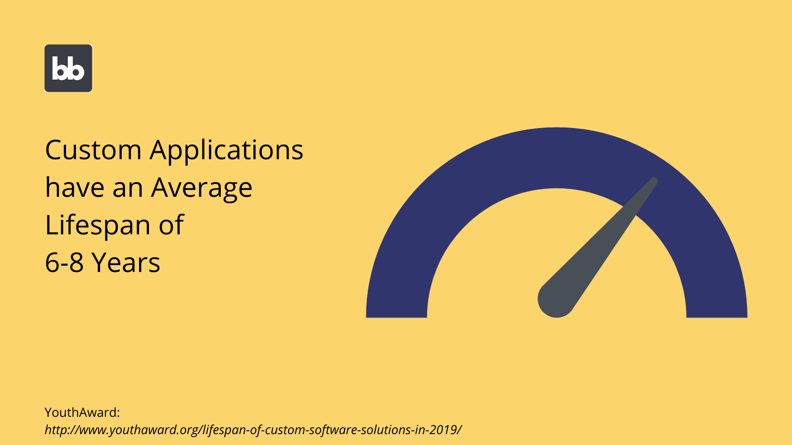
There are a couple of levels to this:
- Designing tools that will remain useful in the long term.
- Building in flexibility and scope for modification to meet new challenges.
One critical step here is preempting new features.
This doesn’t mean you need to have a crystal ball.
Rather, the idea is to plan for features that you could plausibly need for a given type of interface. So, an obvious example would be factoring in the need for extra attributes into your initial admin panel design, even if you don’t need them just yet.
The broader principle here is that you need to focus on creating UI layouts that will easily facilitate new features, even if you yet don’t know what these will be.
Essential UI design tools for enterprise teams
We also need to think about the specific tools we can use to put our tips into practice. As we said earlier, enterprise design teams are largely constrained by a range of operational, technical, and other considerations, that smaller organizations don’t have to contend with.
With that in mind, here are the main categories of interface design tools that are commonly used in enterprise settings.
Traditional design tools
Of course, enterprises use many of the same tools as any other design team. For example, visual tools like Figma, common front-end frameworks like Rails, or even custom HTML and CSS documents.
After all, these kinds of tools are ubiquitous for a reason.
That is their extensive scope. In the hands of skilled designers, the possibilities are endless.
However, the trouble is speed. In most enterprise settings, design teams spend their time building similar tools, over and over again.
This means that building interfaces from scratch using traditional design tools is rarely the most cost-effective option or the best use of your team’s time. This applies to situations where you need to make changes to existing designs too.
Instead, modern enterprises prioritize tools that allow them to carry out repetitive design tasks at pace.
No-code for enterprises
One option is using no-code design tools. As the name suggests, these are platforms specifically designed to enable users to build applications, with no coding skills required. Usually, this involves a combination of drag and drop interfaces and prebuilt app templates.
Naturally, this means that builds are incredibly fast, and, therefore, cost-effective.
However, there are other factors at play here that can often make no-code tools unsuitable for enterprises.
The core of the matter is a lack of flexibility.
That is, by their nature, no-code tools often offer limited functionality. Since there’s no way to add custom code to your interfaces, there’s effectively no way to add anything to your app that isn’t natively supported.
So, although no-code development offers very quick turnaround times, individual platforms will be unsuitable for specific projects. As such, widespread use might not be viable in enterprise settings.
Low-code design tools
Low-code design tools bridge the gap between the expediency of no-code and the customization of traditional builds. That is, the goal of these kinds of tools is to provide fast, easy design experiences while offering flexibility and customization when you need it.
This also means that low-code tools are more suited to the non-technical challenges encountered by design teams.
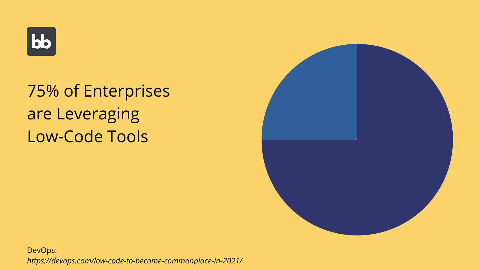
Earlier, we discussed the need for tools to be thoroughly vetted and signed off by enterprise IT teams before they can be adopted.
This process might not be worthwhile for no-code tools, as they offer more limited use-cases. The cost/benefit calculation changes greatly for low-code tools, as these can be leveraged in a much wider range of contexts.
Additionally, low-code platforms generally offer advanced features and configuration options that make them more suitable for enterprise environments. For example, Budibase offers self-hosting, free SSO, and a range of other enterprise-grade features.
Low-code UIs to maximize productivity from Budibase
We’re biased, but we think Budibase is the smart choice for enterprise app UI design.
Our open-source, low-code platform is built to empower designers to create custom tools, in minutes. Enjoy custom RBAC, optional self-hosting, advanced automated, auto-generated CRUD screens, and a range of other incredible features while you build enterprise tools.
We’ve even created 50+ app templates to showcase what our platform can do.
Budibase is trusted by massive organizations around the world for unrivaled functionality, security, expediency, and developer experiences.
Check out our product page for more information.