June 2021 release - Build an SQL CRUD app in seconds
The June release significantly improves the developer experience when; building CRUD apps with an SQL database, laying out components, and delivering responsive apps.
TL; DR
- Build SQL CRUD apps in seconds
- A new layout settings bar
- Preset layouts
- Responsive navigation layout
- Improved design experience
- Confirmation modal for actions
Build SQL CRUD apps in seconds
Previous to this release, SQL was supported but the experience was tedious. We talked with our community, we listened hard and went back to first principles, and the outcome is an entire new and improved SQL experience. With this release, connecting your MySQL or PostgreSQL database to Budibase will pull your information about your tables so you can benefit from the same functionality as internal tables. Expanding on this, you will now be able to:
- Auto-generate ‘list’, ‘detail’, and ‘new’ screens
- View SQL tables within Budibase
- Auto-generate forms from your SQL tables
- Automations are fully compatible with SQL tables
- Effortlessly filter SQL data using the data provider component
- SQL pagination is now supported
- Basic relationship functionality
A new layout settings bar
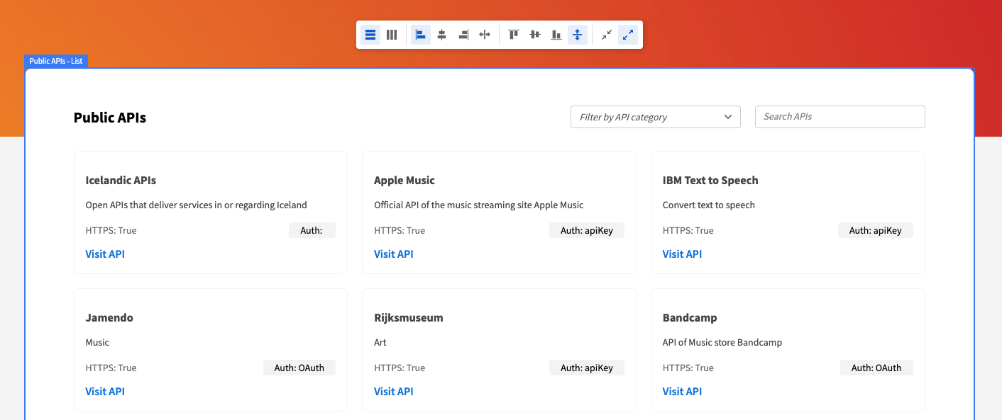
You can now customize the layout of your user interface (UI) using the new layout settings bar. The settings bar is activated by clicking on a container within the design screen, and it makes designing UIs easier, faster, and in our opinion, greatly improves user experience.

Layout presets
Many of the apps created with Budibase follow similar design patterns. With this knowledge, we’ve released a new Section component that contains layout presets. These presets mirror the common design patterns, helping users layout new sections in seconds.
Responsive navigation layout
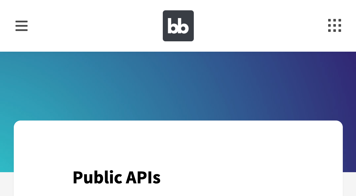
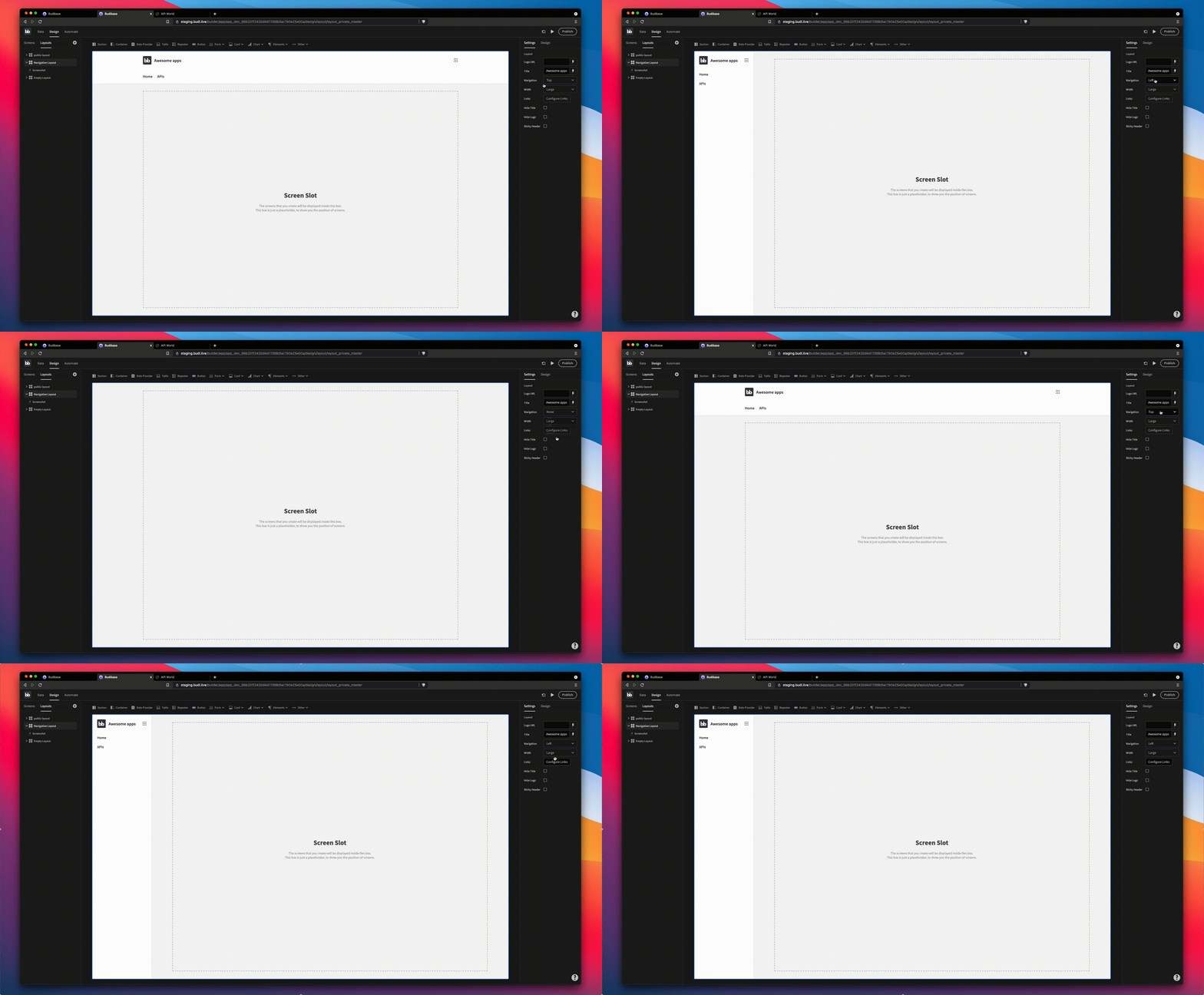
The new Navigation Layout replaces the existing Top Navigation Layout, and now comes with two presets; top navigation and side navigation. The side navigation is a welcomed addition and common request from the community, and with this release, it’s just 2 clicks away - and it looks awesome. I’m also happy to announce the new navigation layout is responsive, and works seamlessly across mobile, tablet and desktop. To top it off, the navigation layout now comes with a new portal icon that, when clicked, allows users to return to their portal and log out.

Improved design experience
A lot of work has gone into improving the interactivity of the design screen, including component labels, improved highlighting, and component stabilization. Hopefully you’ll agree, the design experience is smoother, more informative and enjoyable.

Confirmation modal for actions
With 1 click, add a confirmation modal to critical actions within your apps. This will improve the end-user experience around deleting records, and completing other irreversible actions.
Coming up in the June release
- Sandbox
- Theming
- Conditional UI